niedziela, 29 czerwca 2008

sugarrythme

Karaol Kołodziński illustration & graphic design

YSTO

Catalogue cover made for multi-brand store YSTO;
Made in three different colorschemes. Nelson Balaban

WOZOCO

The Western Garden Cities of Amsterdam built in the 1950s and 1960s, are now confronted with big increases in density that continue to threaten their open green spaces, the most important quality of these areas. As part of this operation, a block of 100 apartments for people over 55 years was proposed to mark the end of a facility strip for the elderly.

To still provide adequate sunlight into the surrounding only 87 of the 100 units could be realised within the block. Where could the remaining 13 dwellings be positioned? If they were put elsewhere on the site, the open space would be further reduced.

By 'cantilevering' the remaining 13 units from the north façade, they are literally suspended in the air. The hanging East-West orientated types complete the North-South dwellings in the block with a view over the adjacent polder. By hanging the extra units on the north façade, the ground plane is kept as open and green as possible. A prototypic increase in density for the garden cities is achieved. MVRDV

bread and butter barcelona

Artwork made for the Bread & Butter event held in Barcelona, Spain
This is a collaboration with Aerosyn-Lex Mestrovic, KDU Creative Director. Nelson Balaban

xtrabold

Logotype/Print design; Used for print, self-promotional and stationery purposes. Nelson
Balaban

soho


Spread illustration produced for Computer Arts Projects #111 as a tutorial opener;
"Designing the Soho Gothic font"

piątek, 27 czerwca 2008

like a scale of fish

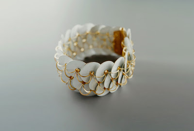
Ralph Bakker: Working as an jewelry-artist is a matter of attitude, a conscious choice for a certain way of working; a mentality. It is of no importance to me whether the piece of jewelry I made exceeds boundaries. My aim is to make a good piece of jewelry and whether it is defined as art is up to others. In making my jewelry I am in search of answers to questions I cannot or will not ask myself, hoping that my jewelry can show me both the questions and the answers. Of great importance are archetypical forms of jewelry; I can be fascinated by a plain linkchain. Mere circles creating a picture and function that cannot be improved, form and function intertwined.

elegant and simply

OPEN!Design

delicate & charming

Ulrike Hamm: Jewellery made from parchment gives unforeseen possibilities, which I'm aiming to explore. Parchment is not a common material, which can be delivered in a standardised form. It is a stubborn, mysterious, vivid, precious and unpredictable material that wants to be explored and conquered. Its inspirational appearance and characteristics allow me to constantly discover new aspects and possibilities, which I trace within it.

inside

Sarah Chilton jewellery

double sweet

if you believe they put the man on the moon


bang bang


a little help if you are nervous


dog mat

great ideas, good design, just enjoy. atypyk

sixeart - barcelona


poniedziałek, 23 czerwca 2008

HAZMATE plush

HAZMATE plush


Bertie the Pipebomb by Ashley Wood x Bigshot Toyworks x Three Zero


alphabet

The North London design and illustrator duo, Present&Correct are creators of paper based goods– both vintage and new — whose desire is to “celebrate all thing British.” The chart “aims to raise awareness of the flora and fauna in the UK and to do it in a fun way that is appealing to both children and adults.
 
Web Statistics